




Organise a customer research presentation around the decisions it feeds, not the order in which the research happened. Each decision gets its own unit of slides: the decision at stake, the evidence you collected, how confident that evidence lets you be, and what follows if the room accepts it. Study chronology belongs in the appendix.
A customer research presentation converts what customers said and did into choices a team can make: which problem to fix, which segment to serve, which assumption to stop treating as fact.
Most insights decks open with goals and method, march through interview quotes and survey charts, and arrive at recommendations in the last three minutes, after attention has drained.
Build the deck from a decision list, not a research plan
Start with the open decisions the research was meant to inform. Write each as a choice with named options rather than a topic:
- "Do we rewrite the first screen this quarter, or add guided setup?"
- "Do we keep the per-seat tier, or test usage-based for the mid-market?"
- "Do we fund a retention workstream now, or wait for the annual cohort to close?"
Three to five decisions is usually the whole deck. A finding that touches no pending decision goes in the appendix or a written summary — a stray finding consumes the time a decision needs.
Then sort by cost of being wrong. The expensive, hard-to-reverse decision goes first, while the room is fresh; the cheap, reversible one can move to a written note.
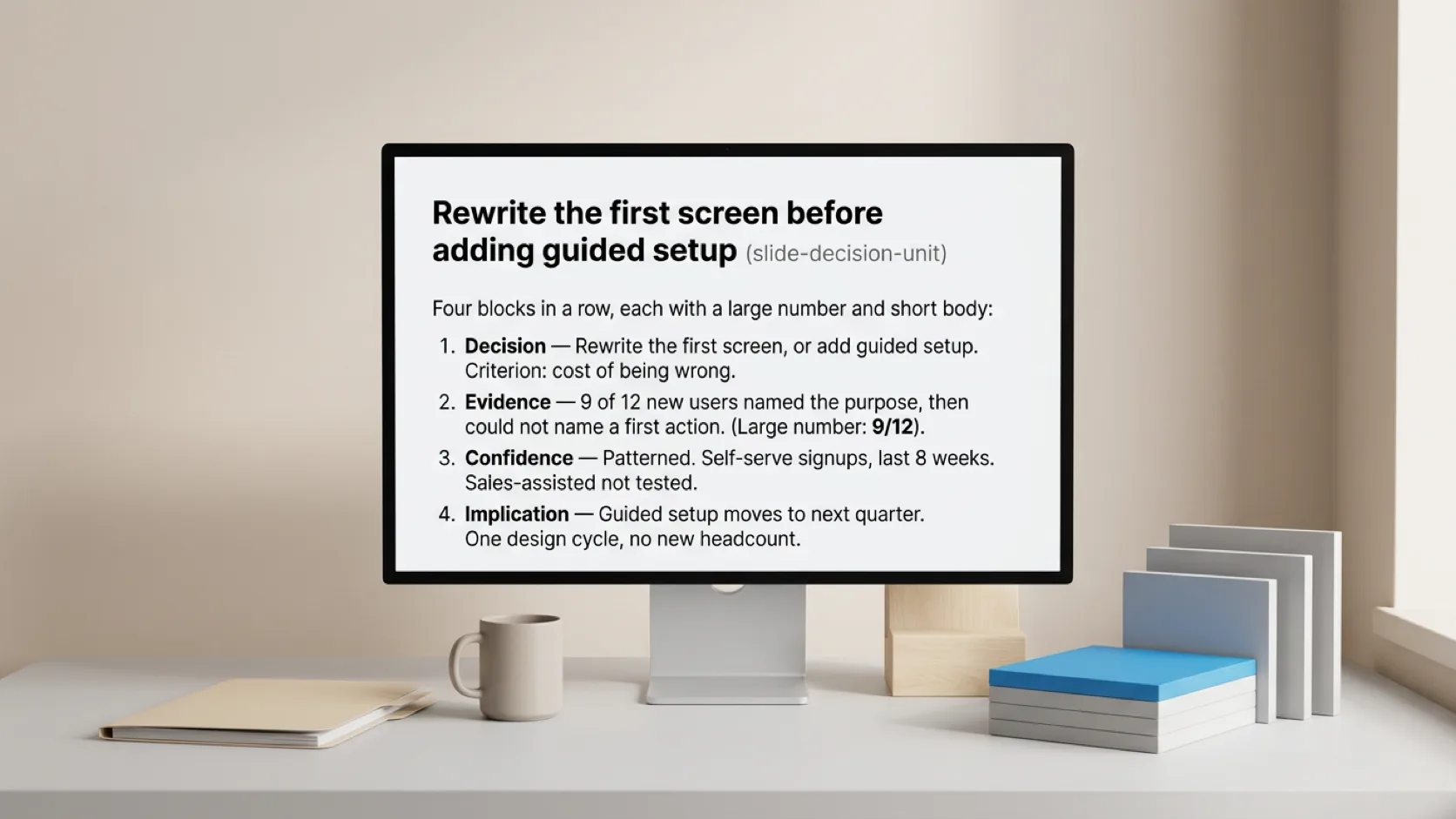
The four-part unit: decision, evidence, confidence, implication
Each decision gets the same four moves. Repeating the shape is the point: after the first unit, the audience knows where in the argument they are and spends attention on content instead of navigation.
- State the decision and your read. The slide title carries the recommendation: "Rewrite the first screen before adding guided setup." The body names the options and the criterion you used to choose between them.
- Show the evidence that separates the options. A chart consistent with both options does not belong in this unit.
- State the confidence and its limits. How many people, which segment, what period, what you did not test, and where the evidence conflicts.
- Name the implication. What changes if the room accepts the read — scope, sequence, budget, or the next thing to go learn.
Write all four sentences for one decision before you open a slide editor. If the confidence sentence is embarrassing to write, the decision is not ready to present, and the honest deliverable is "here is what we would need to know."
Separate what you heard from what you concluded
Keep the layers visible on the slide. Observation: "Nine of twelve participants clicked Settings while looking for billing." Interpretation: "Billing is discoverable only to people who already know where it lives." Recommendation: "Promote billing to the top-level nav." Someone who disagrees can then point at the interpretation without disputing what was observed.
Participant language is persuasive out of proportion to its statistical weight. A vivid quote illustrates a pattern; it does not establish how common the pattern is. When you need prevalence, say which instrument measured it.
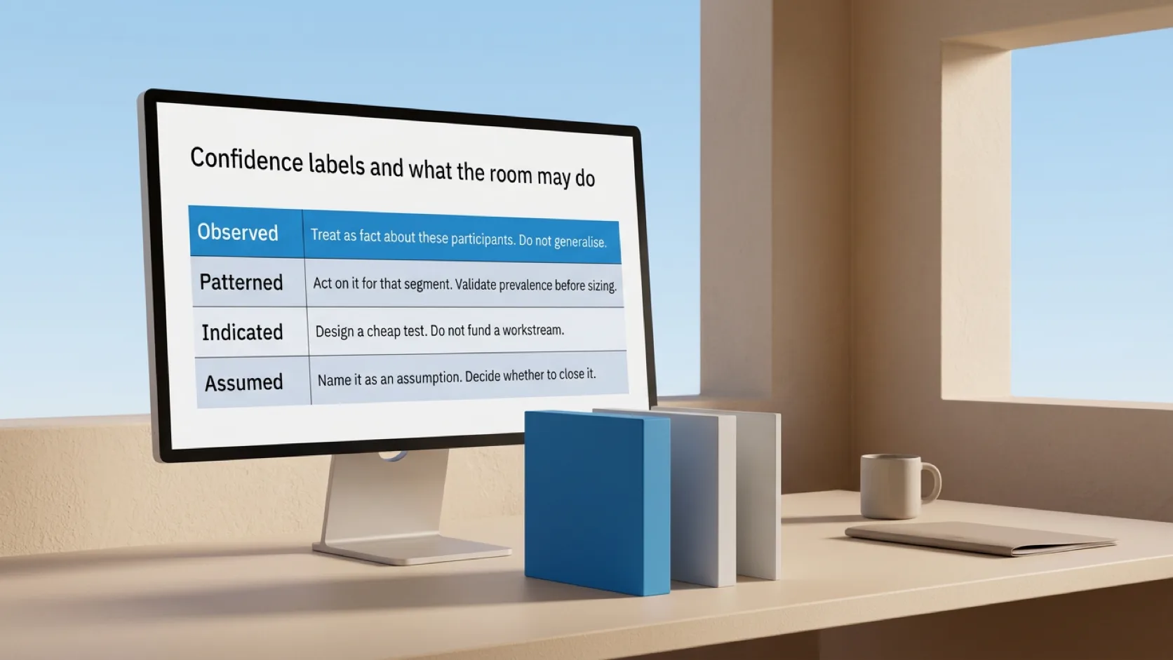
Label confidence in a form people can act on
"High confidence" means nothing on its own. Attach confidence to the claim in terms that change what the room should do with it. A consistent vocabulary works better than a numeric score nobody calibrated:
| Label | What the evidence supports | What the room may do |
|---|---|---|
| Observed | A behaviour or statement recorded directly, with count and sample named | Treat as fact about these participants; do not generalise silently |
| Patterned | The same behaviour across most participants in a segment | Act on it for that segment; validate prevalence before sizing |
| Indicated | Suggestive but thin — few participants, or conflicting signals | Design a cheap test; do not fund a workstream on it |
| Assumed | No direct evidence; an inference filling a gap | Name it as an assumption and decide whether to close it |
Put the label next to the claim, not in a methods disclaimer at the end. Small-sample qualitative work is legitimate and efficient for finding usability problems — Nielsen Norman Group's long-standing guidance is that a handful of users surfaces most issues in a given design.[^nng-five] That same sample cannot tell you how many customers are affected, and labelling the difference on the slide is what keeps a qualitative finding from silently becoming a market estimate three meetings later.
Where evidence conflicts, show the conflict. "Support tickets say pricing is confusing; interviews say the tier names are clear but the overage rule is not" is more useful than either half, and it usually points at the cheapest next study.

A worked example
The structure below is an illustrative rewrite, not a set of real findings. Replace the labels with your own evidence.
Before — chronological insights deck
Background → research goals → methodology → participant profiles → interview themes → survey results → findings → recommendations → next steps.
Nothing here is wrong in isolation. But a reader cannot tell which of the nine interview themes is load-bearing until slide twenty-two, so all twenty-two get equal, shallow attention.
After — decision-led deck
- Decision 1 — Do we rewrite the first screen this quarter?
- Read: yes, before any additional onboarding content.
- Evidence: 9/12 new users described the product's purpose correctly and then could not name a first action; drop-off concentrates at the same step in product analytics.
- Confidence: Patterned for self-serve signups in the last eight weeks. Not tested for sales-assisted accounts.
- Implication: moves guided setup to next quarter; one design cycle, no new headcount.
- Decision 2 — Do we fund a retention workstream now?
- Read: not yet.
- Evidence: churn interviews split between price and a missing integration; no segment dominates.
- Confidence: Indicated. Six interviews, self-selected from cancellations.
- Implication: run a two-week exit-survey instrument first; revisit at quarter close.
- Appendix — method, interview guide, participant profiles, full survey tables, coding notes.
The second version is shorter and asks more of the presenter, because every slide now commits to something.
Assemble the deck without rebuilding it by hand
Work in text until the argument holds. Write the four sentences per decision, read them in sequence, and check that the order matches the cost-of-being-wrong ranking. This is the same discipline as turning rough notes into a slide map before any layout choices — the map is cheap to reorder, the deck is not.
Only then split the text into slides. Each unit typically becomes two to four: one for decision and read, one or two for evidence, one for implication, with the confidence label riding along with the claim it qualifies. Definitions stay beside the number they define. Method and raw material move to the appendix, linked from the evidence slides that rest on them.
This is where Plainline fits: it turns research notes, a findings document, or an outline into clear, editable slides and keeps the content, structure, and composition under your control after generation. You own the claim and the confidence label; the tool removes the manual assembly between the finished analysis and the deck. Plainline encrypts your source text and presentations before storage and does not use them to train models. See how teams turn research material into an insight deck.
If your study is already written up as a long document, cut it to the findings, implications, and decisions one meeting needs before you touch slides. If the raw material is a synthesis session rather than a report, the same separation applies to meeting notes: decision, evidence, open questions, next steps. And for the ordering principle underneath all of this — the answer before the method — see how to present research findings without burying the insight.
Review the deck against five questions
- Does every slide belong to a named decision?
- Can a reader tell, on each evidence slide, what was observed and what you concluded?
- Is a confidence label attached to every claim that would change someone's behaviour?
- Does the implication name a consequence — scope, sequence, money, or a next study — rather than a sentiment?
- Is everything the room does not need in the appendix, and retrievable in one click?
A deck that passes all five is short and uncomfortable to build, because it forces you to say what the evidence can and cannot carry. Research that does not resolve into a decision is a report; research organised around decisions is an input the room can use while you are still in it.
[^nng-five]: Nielsen Norman Group, "Why You Only Need to Test with 5 Users"
Frequently asked questions
How long should a customer research presentation be?
Length follows the decision count, not the study size. Three to five decisions at two to four slides each gives a twelve-to-twenty-slide deck, plus an appendix of any size. Forty slides before the appendix means you are presenting the study rather than the decisions it informs.
Where do quotes belong in an insights deck?
On the evidence slide for the decision they discriminate, with the participant's segment and the count of how many others said something similar. Without that context a quote reads as proof of prevalence when it is proof of existence.
What if stakeholders keep asking about methodology?
Answer with the part that bounds the conclusion — sample, segment, period, what was not tested — and keep the full protocol one click away. Repeated methodology questions usually signal a missing confidence label rather than genuine interest in the instrument: the room cannot tell how much weight a claim carries, so it interrogates the process.
Can I present research that contradicts a decision already made?
Yes, and the four-part unit is the safest vehicle for it. State the decision as it stands, show the evidence that cuts against it, label the confidence honestly, and name the implication as a cost rather than a verdict. "Here is what this choice will likely cost us, at this confidence" invites a recalculation; "the research says you were wrong" invites a defence of the original call.
How do I handle a finding with no clear recommendation?
Present it as a decision about what to learn next. State the question, show what the evidence does establish, label it Indicated or Assumed, and propose the cheapest instrument that would resolve it. "We do not know yet, and here is the two-week way to find out" is a usable meeting outcome; a confident recommendation the data cannot support is discovered later, at higher cost.
Sources
- Why You Only Need to Test with 5 Users — Nielsen Norman Group
- Clear Communication Index: How to Use the Index — Centers for Disease Control and Prevention