




A marketing report is a storage format: channel by channel, metric by metric, so the numbers are recorded and auditable. A results presentation has a different job — getting a room to one shared reading of those numbers and a decision. Converting one into the other means reordering the text around five questions: what happened, what drove it, what we tested, what we now believe, what we do next. That reordering happens in the source document, before any slide exists.
Why the channel-by-channel order fails in a meeting
Most monthly decks inherit the reporting tool's structure: paid search, paid social, organic, email, lifecycle, one dashboard screenshot each. Every slide is defensible on its own. Together they never answer "so did the quarter work?"
The room reconstructs that answer live, out loud, from nine partial views — and reconstructs it differently depending on who talks first. By the time someone asks whether CAC is up or down overall, you are twenty minutes in with nothing decided.
Channel breakdowns still matter. They belong under the driver that made them interesting, or in the appendix.

The five sections of a results presentation
1. Outcome. One slide, first. The headline result against target, in the metric the audience is accountable for — pipeline, revenue, qualified leads, retention — with the gap sized. "Q3 pipeline landed at 82% of target, $1.4M short" is an outcome. "Traffic grew 12%" is a driver pretending to be one. A bad result still goes first: a room that has to dig the bad number out of slide fourteen stops trusting the cadence.
2. Drivers. Three to five slides, each naming a single cause and showing what moved, by how much, and why you believe it caused the outcome. This is the only section where channel detail belongs, and only when the channel is a driver. A channel that performed as planned is appendix material.
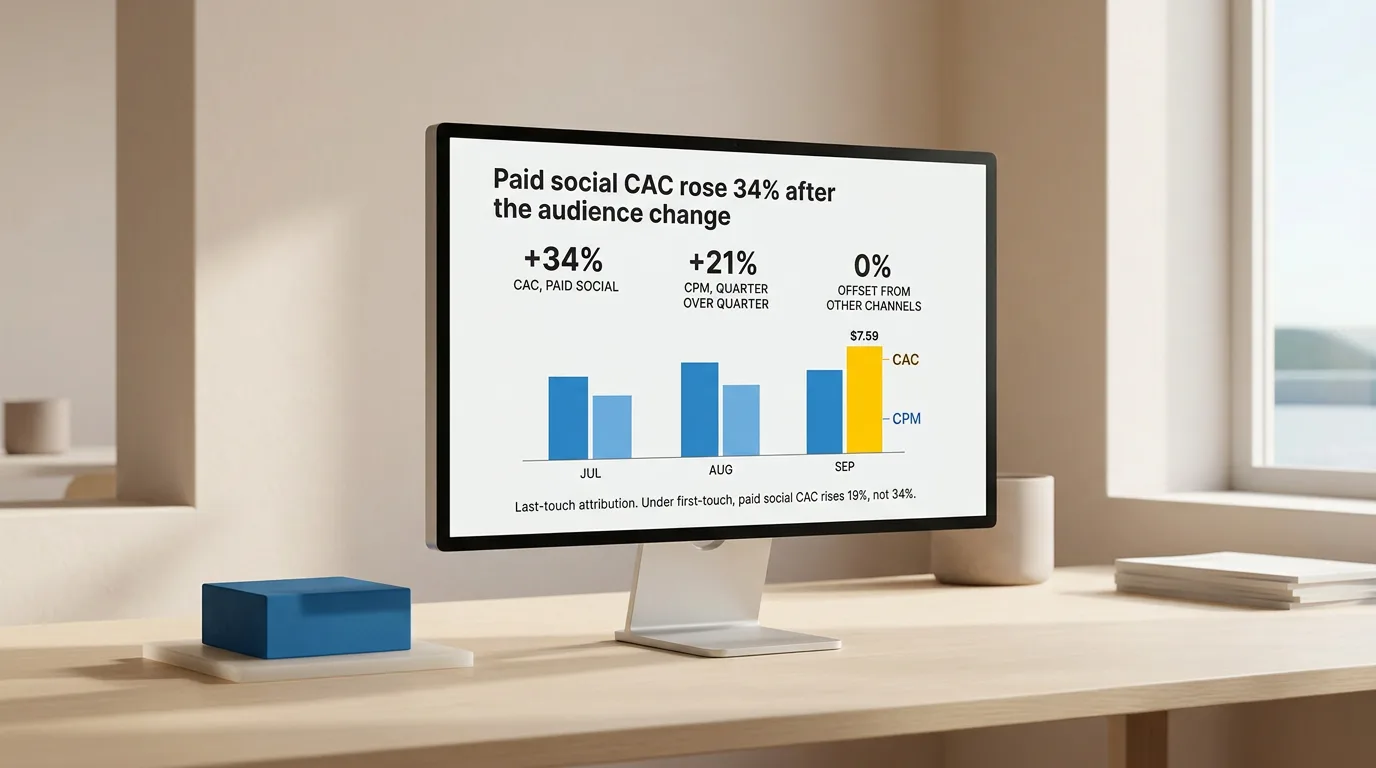
Attribution belongs here, stated plainly. If paid social is credited under a last-touch model and would look different under first-touch, say so on the slide rather than in the Q&A. Drivers you can only assert are hypotheses, and labelling them as such buys the rest of the deck credibility.
3. Experiments. One row per test: hypothesis, what you changed, result, decision, cost. Failed tests belong here at full weight — a section that only shows winners is a section the room discounts entirely. Include tests still running, with their read date, so nobody proposes something already in flight.
4. Learning. The section most decks skip. One or two slides on what you now believe that you did not believe at the start of the period, and what you are less sure about. "We now think the paid ceiling is channel mix, not creative" is a learning; "creative performance varied" is a restatement of a chart.
5. Next actions. What you will do, who owns it, by when, and what you need from this room. Keep actions you are taking anyway separate from decisions you need made in the meeting. An action list with no named ask turns the last five minutes into a scheduling conversation.
The order matches the order the questions get asked in, not what reads well on paper.
What to cut
| Report element | In the presentation | Where it goes instead |
|---|---|---|
| Every channel's full metric table | No | Appendix |
| Dashboard screenshots | No | Link to the live dashboard |
| Methodology and attribution model | Only the parts that change a reading | Appendix, plus a one-line note on the affected slide |
| Flat or on-plan channels | No | Appendix |
| Definitions of custom metrics | Once, where first used | Appendix |
| Failed experiments | Yes, at full weight | — |
| Confidence and caveats on drivers | Yes, on the driver slide | — |
Say at the start that the appendix exists, so nobody asks for numbers you have already prepared.
Make the numbers survive the room
Charts carry one message each. The UK Government Analysis Function's guidance on data visualisation puts it directly: "If you cannot write down the message your chart is giving in a few sentences, you should think again about the chart you have chosen." It also caps clustering at around four lines on a line chart and four categories within a stack. A twelve-line channel chart on a driver slide is a table with delusions.
Colour is not the whole signal. WCAG's use of color criterion requires that colour never be the only visual means of conveying information — pair it with labels, position, or direct annotation. Decks get projected, printed, and screenshotted into Slack, and a red-versus-green performance chart with no labels loses its meaning in all three cases, before anyone with colour vision deficiency opens it.
Constructed metrics deserve the same caution. If you present blended CAC or adjusted ROAS, show the standard measure beside it. The SEC's non-GAAP financial measures guidance treats an adjusted measure presented more prominently than its comparable standard measure as misleading in public disclosure. Internal marketing decks are not filings, but the reflex holds: a room that later discovers the flattering denominator discounts every number after that one.
The workflow, step by step
- Write the outcome sentence first, before opening the report. Result, target, gap, in one sentence. If you cannot write it, what is unfinished is the analysis, not the deck.
- List the causes you would give if asked "why?" three times. Keep the three to five you can evidence.
- Tag every paragraph of the report as outcome, driver, experiment, learning, or next action. Untagged paragraphs go to the appendix. This step does the real cutting.
- Reorder the source document into the five sections. Order fixed in text is order fixed in the deck.
- Rewrite each heading as a claim the room can accept or challenge — "Paid social CAC rose 34% after the audience change," not "Paid social." Headings written as takeaways become slide titles that carry the argument.
- Generate the slides, then read only the titles. End to end, they should state the full story without a single chart. If they don't, fix the source, not the slides.
- Attach evidence to its claim. Each driver slide holds the chart for that driver and nothing else.
- Edit content and sequence first, layout last.
Steps 1 through 4 are the conversion; everything after is assembly.
If your source is a long analytical document rather than a monthly summary, extract the findings and implications before you touch structure — otherwise the five sections inherit chapters instead of conclusions. When the deck is mostly research output, the rules for leading with the conclusion rather than the method apply to the drivers section directly. And if this is the quarterly version with commitments to score, the decision-led QBR structure is the closer fit.

A worked example of the compression
A twenty-two-page monthly report with sections for paid search, paid social, SEO, email, lifecycle, events, and partnerships becomes:
- Outcome (1 slide): MQL-to-SQL conversion held, but pipeline landed 18% under target on volume.
- Drivers (3 slides): paid social CPMs rose through the period and were not offset; the SEO gains arrived in a segment that converts at half the site average; partnerships delivered ahead of plan and partly closed the gap.
- Experiments (2 slides): four tests read, one winner rolled out, two killed, one still running with a read date.
- Learning (1 slide): volume, not conversion, is the binding constraint this quarter, which reverses the assumption the plan was built on.
- Next actions (1 slide): shift a named share of paid social budget to partnerships, hold SEO investment, and one decision requested from the room on the events line.
Eight slides plus an appendix. Every page of the original still exists; most of it is now reference rather than narration.
Where the tool fits
Which result leads, which causes are real, what the failed tests mean — no generator produces that from a metrics export.
What you can stop doing by hand is the assembly: splitting the reordered report into slides, deciding which parts are claims, numbers, quotes, or conclusions, choosing compositions, and keeping typography and spacing consistent across the main deck and the appendix. Plainline takes the written source, splits it into slides, and applies consistent layouts; after generation you edit content, slide order, semantic blocks, layout variants, and media, then preview, share, or export.
Run the conversion once the five sections are in the right order in the text. That sequencing is the work.
Frequently asked questions
How many slides should a marketing report presentation have?
Eight to twelve main slides for a monthly review, plus an appendix holding the full channel detail. Let the number of drivers and requested decisions set the length, not the number of channels you run. If every month produces the same twenty-four slides regardless of what happened, the deck is recording activity rather than supporting decisions.
Should I send the deck before the meeting?
Send it when the room needs time to weigh a decision, and make the outcome slide readable standalone — no build, no verbal setup. Results decks circulate afterward to people who were not in the room, so any slide that only makes sense when narrated will eventually be read without narration and misread.
What if the period's results were bad?
Put the result on the first slide with the gap sized honestly, then spend the deck on cause and response. Softening the headline and revealing the number later costs more trust than the bad period does, because the room learns it has to audit your framing before reading your numbers.
How do I handle attribution disagreements in the deck?
State the model on the driver slide where it changes the reading, and show the alternative figure when the two differ enough to change a decision. Attribution arguments hijack results meetings when the model is invisible; naming it in one line usually ends the argument before it starts.
Can I reuse the same structure every month?
Yes, and you should. A fixed five-section order means the audience learns where to look, and preparation becomes tagging and reordering rather than redesign. The content changes monthly; the hierarchy should not.
Sources
- Data visualisation: charts — UK Government Analysis Function
- Understanding SC 1.4.1: Use of Color — W3C Web Accessibility Initiative (WCAG 2.2)
- Compliance and Disclosure Interpretations: Non-GAAP Financial Measures — U.S. Securities and Exchange Commission, Division of Corporation Finance