




A research presentation should let decision-makers grasp the answer before they examine the evidence. Lead with the conclusion the research supports, then show what they need to understand, trust, and act on it. Do not make the audience reconstruct the story from charts, quotes, and methodology slides.
That is not permission to overstate the research. Separate the finding from its support, and state the scope, uncertainty, and open questions.
A research presentation is a deck that carries a finding to the people who will act on it: the conclusion, the evidence that supports it, the limits on that evidence, and the decision it enables. It is not a report of how the study was run.
The pass from findings to a deck has five steps:
- Name the decision the deck must support and who makes it.
- Write the conclusion the research supports as the first slide title.
- Turn the research notes into a storyline of claims, ordered by what the decision needs.
- Give each evidence slide one question to answer, keeping claim, evidence, and interpretation separate.
- Edit in two passes — first the argument across slide titles, then each slide on its own.
Start with the decision the deck needs to support
Before choosing slides, write one sentence for the person receiving the presentation:
After this presentation, they should understand [finding] and decide, discuss, or investigate [next step].
For a product team, the next step may be a prioritisation decision; for leadership, funding further work; for a client, deciding whether the evidence warrants a change in direction.
Then write the main message in plain language. It should answer the research question, not describe the process.
Weak main message: “We conducted 18 interviews and analysed survey responses.”
Useful main message: “Participants could complete the task, but did not recognise the pricing step as a commitment point.”
The second sentence gives the audience something to evaluate. Methods, sample, and quotes support that evaluation.
Turn research notes into a storyline
Structure the presentation around the audience’s reasoning:
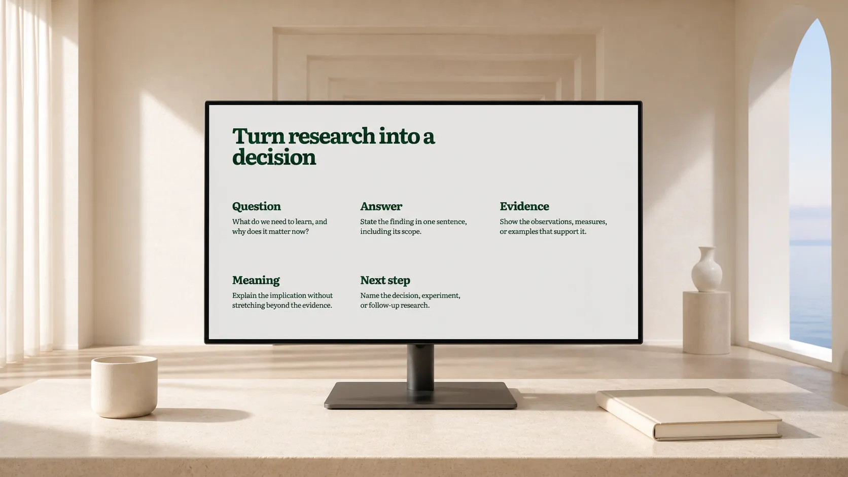
- Question and decision. What did you need to learn, and why does it matter now?
- Answer. State the finding in one sentence, including its scope.
- Evidence. Show the observations, measures, or examples that support it.
- Meaning. Explain the implication for the decision without stretching beyond the evidence.
- Next step. Name the decision, experiment, or follow-up research.
A methods-first deck asks people to retain details until the conclusion appears. An insight-led deck gives each detail a purpose: answering “why should I believe this?”
Put the main message near the beginning and make slide headings state the point. Clear-communication guidance likewise recommends identifying the primary audience and main message first, placing that message at the top, and showing only the information needed for it.[^cdc-index]
A before-and-after example
This is an illustrative rewrite of a common evidence dump, not a set of research findings. Replace its labels with verified evidence.
Before: a chronological deck
- Background
- Research goals
- Methodology
- Interview quotes
- Survey charts
- Findings
- Recommendations
These ingredients may all be necessary. But the audience cannot know which quote or chart matters until the end.
After: an insight-led deck
- Finding: “New users understood the product’s purpose, but not the first action to take.”
- Evidence: Representative observations and a chart answering one question: where did understanding break down?
- Explanation: “The first screen describes capabilities before it gives users a task.”
- Implication: “Clarify the first action before adding more onboarding content.”
- Decision: “Approve a revised first screen and test whether task initiation changes.”
This chain makes the route from observation to decision visible without removing rigour. Keep the full interview guide, dataset, coding notes, and additional charts in an appendix or linked research repository for people who need to audit the work.
Make every evidence slide answer one question
An evidence slide is not a storage container. Give it one question and include only what answers it.
- “Where does the flow fail?” may use a journey excerpt, task-completion pattern, or selected observations.
- “Who is affected?” may use a segmented result, if the sample supports that comparison.
- “How confident are we?” may show sample limits, conflicting evidence, and what was not tested.
Use a title that states the takeaway, not the chart type. “Activation drops after plan selection” is easier to discuss than “Activation funnel.” The chart can still show the numbers, definitions, and time period.
Choose the visual encoding for the comparison readers need to make. Research on graphical perception tested how accurately people judge common visual encodings; the graphic should serve the comparison, not decorate the slide.[^cleveland-mcgill] If the source does not support a precise comparison, say so rather than making a chart imply one.
Keep the claim, evidence, and interpretation separate
Research decks become misleading when these layers blur:
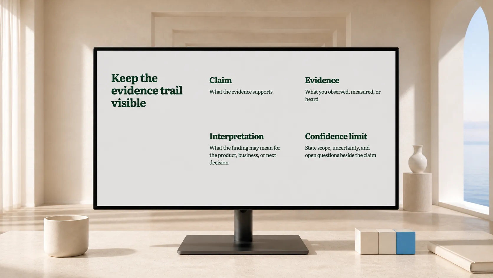
- Claim: What the evidence supports.
- Evidence: What you observed, measured, or heard.
- Interpretation: What the finding may mean for the product, business, or next decision.
State a confidence limit beside the claim when it changes how the audience should act. For example: “This appeared in exploratory interviews; validate prevalence before using it to size the opportunity.” A tiny methods disclaimer at the end cannot do that work.
Do not turn participant language into a universal statement. A quote can illustrate a pattern; it cannot establish prevalence on its own. An average can hide meaningful variation. When evidence conflicts, show the conflict and explain what would resolve it.
Edit the deck in two passes
First, work in text. Write a one-line assertion for each slide and check that the sequence supports the main message. Delete slides that repeat a point or do not change the audience’s understanding. Move necessary detail to the appendix.
Then arrange the evidence. Split dense notes into slides organised by question. Keep definitions beside the number or chart that needs them. Make source, sample, and fieldwork context easy to find when they affect interpretation.
This is where a controlled deck editor is useful. Plainline can turn research notes, documents, or an outline into clear, editable slides, then let you change the content, structure, and composition. You remain responsible for the claim; the tool helps turn existing thinking into a deck without manual layout.
Use this final review before presenting
- Can someone state the answer after the first two slides?
- Does each evidence slide answer a specific question?
- Can a skeptical colleague trace each major claim back to its evidence?
- Are limitations visible where they affect the decision?
- Is the final ask a decision or next step, rather than a vague recommendation?
When the study itself is written up as a long document, cut it down to an executive presentation before designing a single slide, and keep the storyline editable so the evidence trail survives review. For the general six-step workflow this presenting step closes, see how to create a presentation with AI. When the study has to serve several pending choices at once, organise the deck around the decisions rather than the findings. When the answer is clear, the audience can test the interpretation and make the decision. When it is buried, the meeting becomes a search through material the research team has already interpreted. Keep the deck clear and the evidence trail intact.
[^cdc-index]: CDC Clear Communication Index: How to Use the Index [^cleveland-mcgill]: Cleveland & McGill, “Graphical Perception”
Frequently asked questions
How do I open a research presentation?
With the conclusion the research supports, stated in the first slide title. Method, sample, and process slides explain how you reached it and belong after it or in an appendix. An audience that learns the answer first reads the evidence to test it; an audience that waits for it skims.
How much methodology belongs in the deck?
Only the part that changes how much weight the finding carries: sample, period, and the limits that bound the conclusion. Full protocol, instruments, and raw data go in the appendix, linked from the slide that needs them. Keep the rest retrievable rather than presented.
How do I keep a claim separate from my interpretation?
Give each slide one claim in the title, the evidence in the body, and the interpretation as clearly labelled text. When the audience can see which sentence is measured and which is inferred, disagreement lands on the inference instead of casting doubt over the whole finding.
What if the research does not support a clear recommendation?
Say so on the first slide, then present what the evidence does establish and what would be needed to close the gap. An honest statement of uncertainty is a usable input for a decision; a confident recommendation the data cannot carry is not, and it is discovered later.
Sources
- Clear Communication Index: How to Use the Index — Centers for Disease Control and Prevention
- Graphical Perception: Theory, Experimentation, and Application to the Development of Graphical Methods — Journal of the American Statistical Association