




Start by separating the source into claims, evidence, and caveats. Give each slide one claim, keep its supporting evidence close, and choose a layout that fits the relationship between them. A text-to-presentation tool can produce the first draft, but only a draft you can reorder and rewrite is worth having.
This tutorial applies that process to a public source: a 2024 analysis from the U.S. Energy Information Administration (EIA). The example shows how paragraphs become slide claims, how numbers gain hierarchy, and where forecast language must remain visible.
Text to presentation is the pass from written source material to a deck: the text is split into claims, evidence, and caveats, each claim becomes one slide, and a layout is chosen for the relationship between the claim and its support. The tool that builds the draft matters less than the map it builds from.
The pass has five steps:
- Name the decision the presentation supports.
- Mark what the source states as fact, as estimate, and as forecast, keeping those labels.
- Map paragraphs to claims and attach the evidence for each.
- Generate a draft from the map and edit its order, headlines, and layouts.
- Check every claim, number, and caveat in the draft against the source.
Define the decision the presentation supports
One source document can serve several presentations. An energy-market article could become an executive briefing, a policy explainer, or a project update, each with a different sequence.
Before importing the text, write a short brief:
Audience: Leadership team
Decision: Understand the planned mix of new U.S. generating capacity in 2024
Length: Five slides
Keep: Source dates, units, and forecast language
Exclude: Claims about completed 2024 projects or current capacity
The brief establishes what deserves emphasis. For this audience, the main change comes first, followed by supporting numbers and the limits that qualify them.
Preserve the source's status
The example uses the EIA article “Solar and battery storage to make up 81% of new U.S. electric-generating capacity in 2024”. EIA published it on February 15, 2024, using its Preliminary Monthly Electric Generator Inventory from December 2023. The page reports plans and expectations, so the slides must retain words such as “planned,” “scheduled,” and “expected.”
The article reports 62.8 gigawatts of planned utility-scale capacity additions. Solar represents 58% of that plan and battery storage 23%. Later sections cover comparisons with 2023, state-level detail, named projects, and policy context.
That sequence works in prose. A deck needs a more visible hierarchy; copying each paragraph into a text box would preserve the words but obscure the argument.
Map paragraphs to claims before choosing layouts
A claim-led slide keeps the takeaway and its supporting evidence in one composition.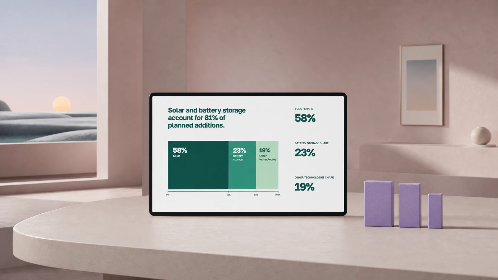
First, label each source block by its role. Leave design decisions for the next pass.
| Source block | Semantic role | Slide claim | Evidence to retain |
|---|---|---|---|
| Lead | Main finding | Developers planned 62.8 GW of additions for 2024 | 62.8 GW; 55% above capacity added in 2023 |
| Solar and battery shares | Composition | Solar and batteries account for 81% of the plan | 58% solar; 23% battery storage |
| Solar section | Change over time | Planned solar additions reached 36.4 GW | 36.4 GW planned for 2024; 18.4 GW added in 2023 |
| Battery section | Scale and location | Planned additions could bring battery capacity close to double its prior level | 14.3 GW planned; 15.5 GW existing; Texas and California account for 82% of additions |
| Other technologies | Remainder | Wind, gas, and nuclear form the smaller remainder | 8.2 GW wind; 2.5 GW gas; 1.1 GW nuclear |
The map exposes a distinction that a generic summary might lose: the 2023 solar figure describes completed additions, while the 2024 figure describes scheduled additions. They can appear in the same chart only if its labels preserve that difference.
Research on assertion-evidence slides supports claim-led design in one bounded setting. In a study of 110 engineering students, sentence headlines paired with relevant evidence produced stronger comprehension and recall than common PowerPoint-style slides with the same narration and information. The study does not guarantee the same result for a business deck, but it supports a useful editing order: write the claim, then select the evidence needed to understand it. See Garner and Alley’s study.
Turn the map into a five-slide draft
| Slide | Assertion headline | Evidence hierarchy | Editable layout |
|---|---|---|---|
| 1 | Developers planned 62.8 GW of new utility-scale capacity for 2024 | Hero number: 62.8 GW; support: 55% above 2023 additions | Hero number with one comparison |
| 2 | Solar and battery storage account for 81% of planned additions | Primary: 58% solar; secondary: 23% battery | Two-part share graphic or paired bars |
| 3 | Planned solar additions reached 36.4 GW | Primary: 36.4 GW planned; comparison: 18.4 GW added in 2023 | Two-column comparison with status labels |
| 4 | Planned battery additions could bring capacity close to double its prior level | Primary: 15.5 GW existing plus 14.3 GW planned; support: Texas 6.4 GW and California 5.2 GW | Stacked capacity bar with two state callouts |
| 5 | Wind, gas, and nuclear form the smaller remainder | 8.2 GW wind; 2.5 GW gas; 1.1 GW nuclear | Ranked horizontal bars |
Each slide needs a compact source line: “EIA Preliminary Monthly Electric Generator Inventory, December 2023; plans reported for 2024.” Keeping that qualifier beside the claim is more useful than isolating it on a final bibliography slide.
Different evidence relationships call for different visual hierarchies and layouts.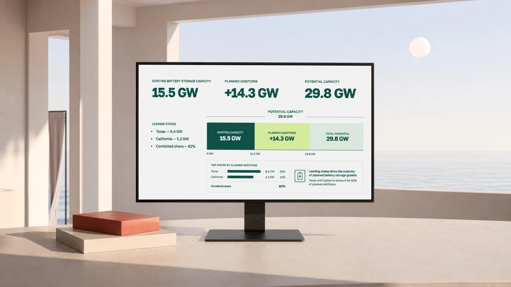
The evidence determines the layout. The opening slide needs one dominant number; the second shows a part-to-whole relationship; the third compares periods with different statuses. The fourth combines a capacity calculation with geographic concentration, and the fifth ranks the remainder. A repeated title-and-bullets template would flatten these differences.
See what changes between article and presentation
| Before: article | After: presentation |
|---|---|
| Paragraph order follows the author’s explanation | Slide order follows the audience’s decision |
| Topic labels such as “Solar” introduce sections | Sentence headlines state the takeaway |
| Numbers share one paragraph and similar emphasis | One number leads; supporting figures sit below it |
| Forecast language appears inside sentences | Status and source date stay attached to each visual |
| Layout comes from the page template | Layout reflects the relationship in the evidence |
The text gets shorter, but summarization alone is not the improvement. The deck keeps enough evidence to support each headline and moves the remaining detail to the source document or speaker notes.
Generate and edit the first draft in Plainline
Plainline works with documents, notes, reports, memos, and outlines that already contain the author’s thinking. Import the source, add the audience and decision from the brief, and generate a draft.
Review its outline before adjusting typography or spacing. Read the slide headlines in order: the opening should state the main finding, the following slides should support it, and the last should complete the requested briefing. It is cheaper to move or remove a claim at this stage than to polish a slide the deck does not need.
Then edit the semantic blocks. The main number can switch from a hero metric to a bar without changing the evidence. A supporting detail can move to speaker notes; a crowded comparison can split across two slides. Because the content, structure, and composition remain editable, the author works with claims and evidence instead of dragging text boxes into place.
In the full-deck preview, typography, spacing, and placement should make the hierarchy recognizable from slide to slide. Media should explain evidence; decorative images that compete with the figures can be removed.
Review the draft against the source
Status labels keep planned additions from being confused with completed additions.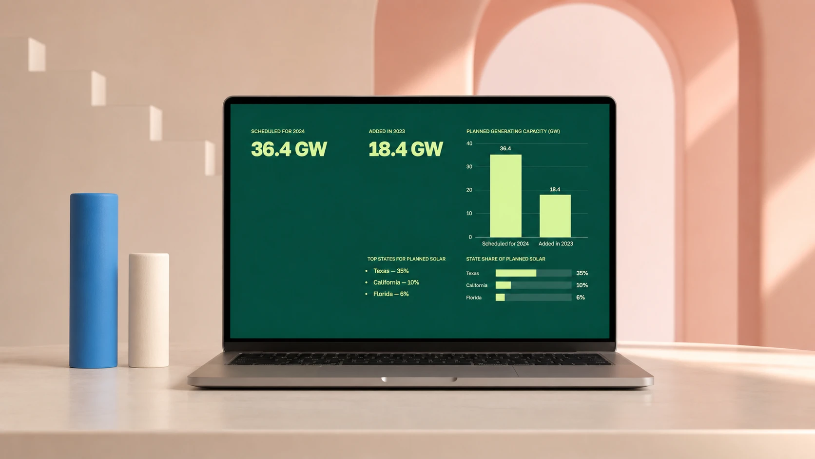
Text-to-presentation AI still needs an editorial pass:
- Accuracy: Match every number, unit, date, and comparison to the source. Here, 36.4 GW is planned capacity, while 18.4 GW is capacity added in 2023.
- Hierarchy: Read the headlines in isolation. Together they should cover total planned additions, dominant sources, solar change, battery scale, and the remainder.
- Layout: Check that each composition fits the evidence. Shares need a part-to-whole view; rankings need aligned bars.
- Traceability: Keep the source and date near each factual slide. Preserve qualifiers such as “planned” in the headline or chart label.
Microsoft’s guidance for its own file-based presentation generation also tells users to review and edit AI-generated output. It recommends document styles so the system can read the source structure. The practical boundary is clear: generation starts the deck; the author remains responsible for its meaning and accuracy. See Microsoft’s file-to-presentation guidance.
Use document hierarchy when the source already has it
Headings mark sections, subheadings group evidence, and labels distinguish quotes or numbers from body text. These signals help a conversion tool find slide boundaries without treating every paragraph as a separate slide.
This principle predates generative tools. PowerPoint can import a Word outline, mapping Heading 1 to slide titles and Heading 2 to slide body text. Without heading levels, it may create a slide for each paragraph. See Microsoft’s outline import instructions.
Plain text can express the same hierarchy:
# 62.8 GW of additions were planned for 2024
## Solar: 36.4 GW planned
## Battery storage: 14.3 GW planned
Source: EIA, December 2023 inventory
Status: Planned capacity, not completed additions
Plainline does not require this format, but explicit hierarchy gives the author tighter control over slide boundaries. When the source is a finished file rather than pasted prose, turning a document into editable slides covers the extra preparation; the comparison of AI slide generators covers what survives export in each tool. After generation, start with the headlines, compare each claim with the source, and change layout variants only after the argument reads in order. The result remains editable, shareable, and exportable, with the source meaning visible in its structure.
Frequently asked questions
How do I turn text into a presentation without rebuilding every slide?
Separate the source into claims, evidence, and caveats first, then give each slide one claim with its evidence beside it. Generate the draft from that map. A draft built on a claim map can be reordered and rewritten; a draft built on raw paragraphs has to be rebuilt when the argument changes.
How much text should go on one slide?
One claim, plus the evidence needed to judge it. When a slide carries two claims, the audience picks one and misses the other. When it carries a paragraph, they read instead of listening. Supporting detail that does not change the claim belongs in an appendix or the speaker notes.
Do AI presentation tools keep my original wording?
Some do, and it is worth checking before you paste. Tools differ on whether generation preserves, rewrites, or summarizes your text, and on how much you can change afterwards. If the wording matters — a quoted figure, a hedged claim — pick a mode that preserves it and verify the draft.
What should I check in the generated draft?
Every number against the source, including its timeframe and units; every hedge the source used; the slide order against your claim map; and any slide the tool added that your text never mentioned. Generation optimizes for a complete-looking deck, which is how invented context appears.
Sources
- Solar and battery storage to make up 81% of new U.S. electric-generating capacity in 2024 — U.S. Energy Information Administration
- The Assertion-Evidence Structure and Comprehension of Presentation Slides — Penn State College of Engineering
- Create a new presentation with Copilot in PowerPoint — Microsoft Support
- Create a PowerPoint presentation from an outline — Microsoft Support